We turn complex, inconsistent brand assets into streamlined, functional design that enhances communication and performance.
From corporate presentations to complete brand systems, our work improves clarity, usability, and alignment across touchpoints. Each project demonstrates how purposeful design can support strategic goals, engage stakeholders, and increase operational efficiency.
Good design doesn’t demand attention — it guides it.
Here’s how
we prove it.

Visual Identity for Trust and Recognition
Problem
MKI needed a more cohesive and credible visual identity to reflect the professionalism of their logistics operations and improve brand recognition in the field.
Solution
Visual identity refinement — focused on functionality, using clean layouts and typography to improve brand perception.
Trust-driven color palette — developed to convey reliability and professionalism across all touchpoints.
Application across fleet and materials — implemented consistently on vehicles, institutional documents, uniforms, and signage for immediate brand recall.
Solution
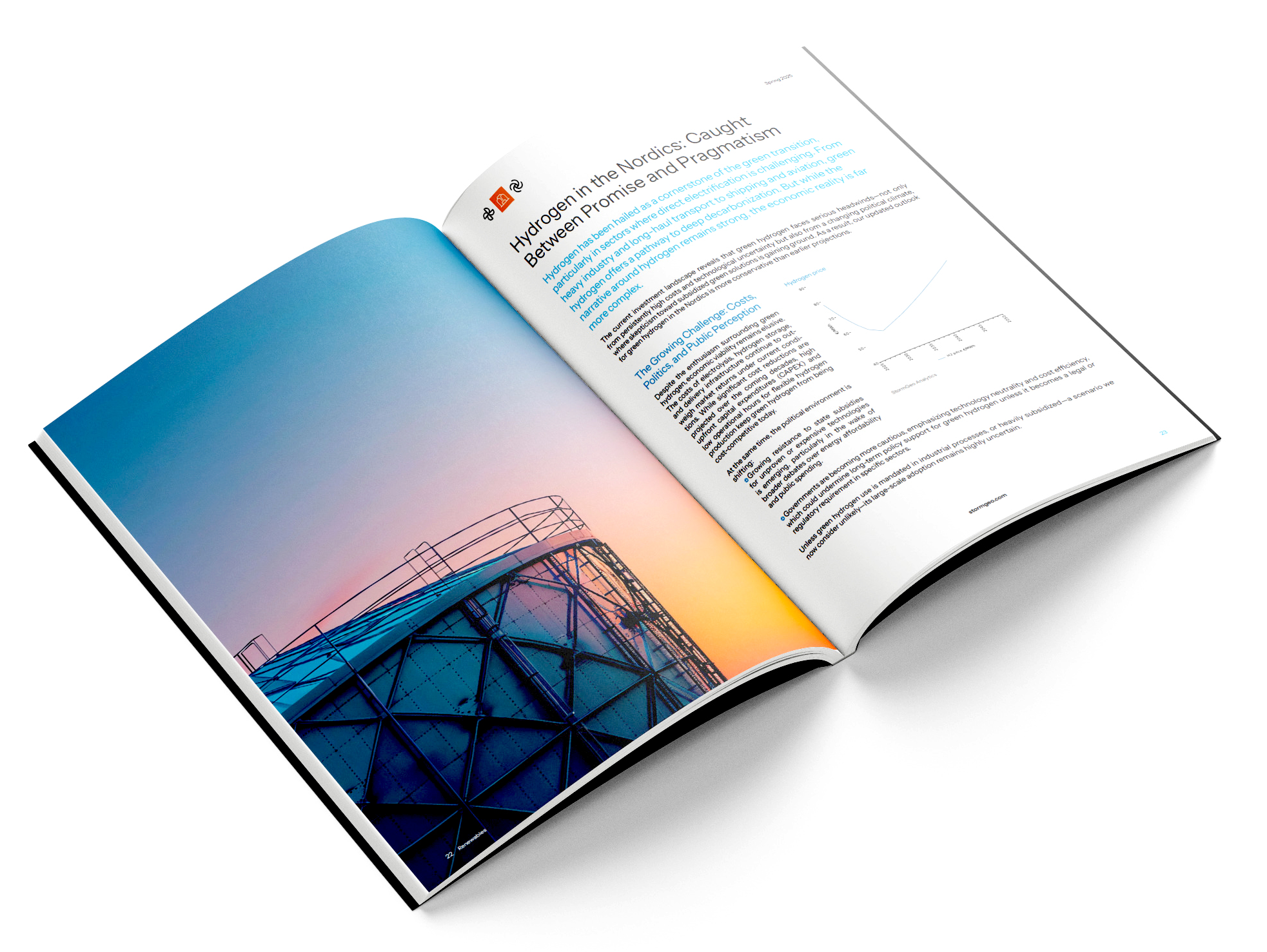
Strategic Deck redesign and animation — transforming dense content into a clear, engaging narrative through functional, purposeful design.
Elevated report design — improving the reading experience with layout choices that guide attention and simplify comprehension.
Campaign visuals for social and exhibitions — designed to be visually cohesive, easy to navigate, and aligned with brand tone.
Problem
StormGeo needed to present complex insights and reports with clarity and consistency, aligning design with the value of their data.
Strategic Communication Tools

Full Rebrand & Visual System Overhaul
Problem
The client sought a more mature, streamlined identity to reflect their evolution and raise the bar across all brand interactions.
Solution
Complete rebrand (logo, visual ID, website) — built from core brand strategy, designed for clarity, scalability, and distinction.
Presentation, sales, and report templates — transformed into functional tools that simplify storytelling and improve delivery.
Social media and in-house systems — built for efficiency, consistency, and ease of use by non-design teams.
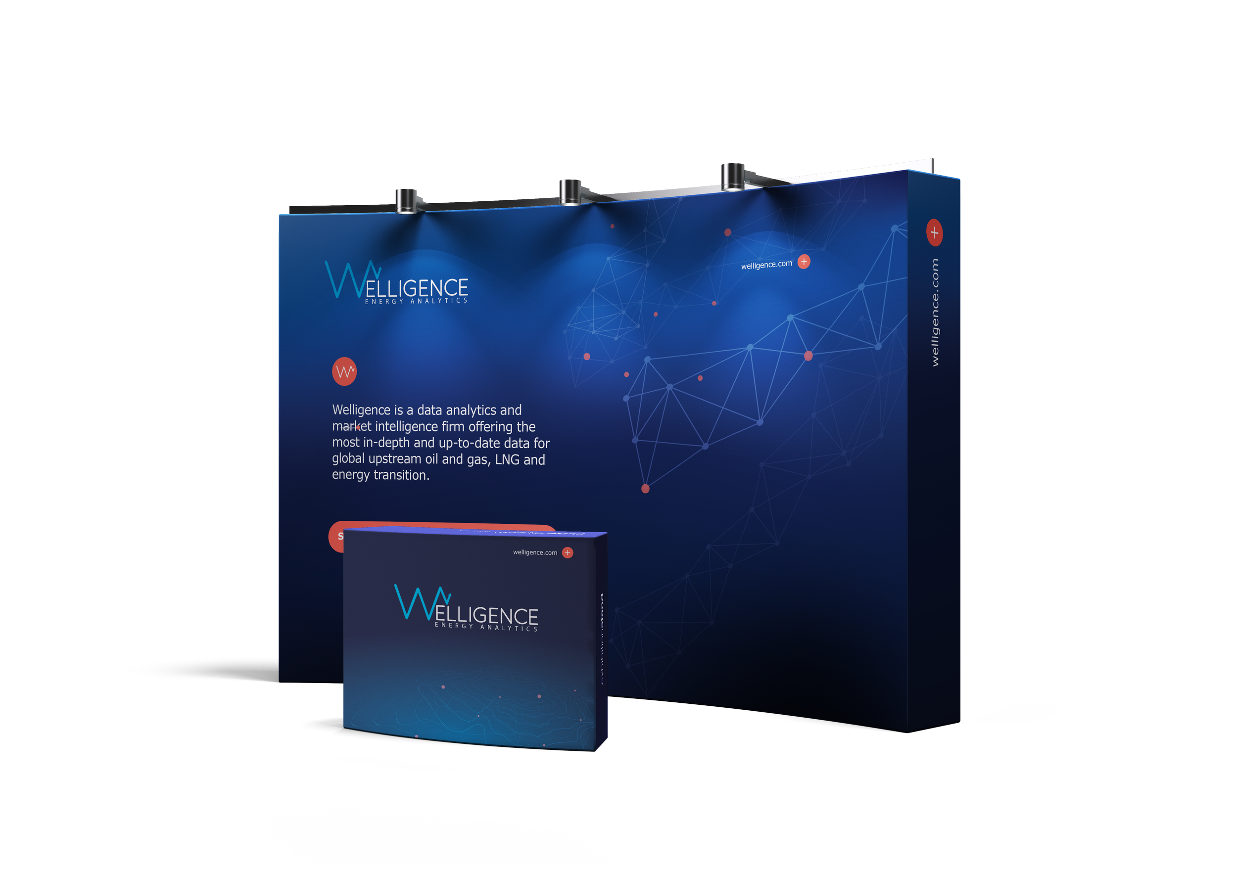
Brand Evolution & Consistency
Problem
As Welligence expanded, they aimed to unify their visual presence and simplify internal workflows, without losing brand voice or momentum.
Solution
Internal and external collateral design — creating consistent visual systems that help teams communicate faster and better.
Website landing page refresh — applying functional design to improve content flow, clarity, and user engagement.
One-pagers, campaigns, and booth assets — all built to be both easy to use and visually aligned, ensuring brand coherence.

Clearer Communication for Client Support
Solution
Visual language redesign — simplified iconography, layout, and tone to make interactions intuitive and approachable
Support materials upgrade — refined brochures, digital guides, and posters to deliver information clearly and efficiently.
Improved visual consistency — ensured all touchpoints reflect a supportive and professional experience.
Problem
Support Link’s client communication lacked visual clarity, making it harder for users to understand how to reach out and navigate their services.